Equity Investing: Part 3 - Making Investing Decisions Based on Market Data
All forces of demand and supply collide to give us one number... price. And price is all that matters!
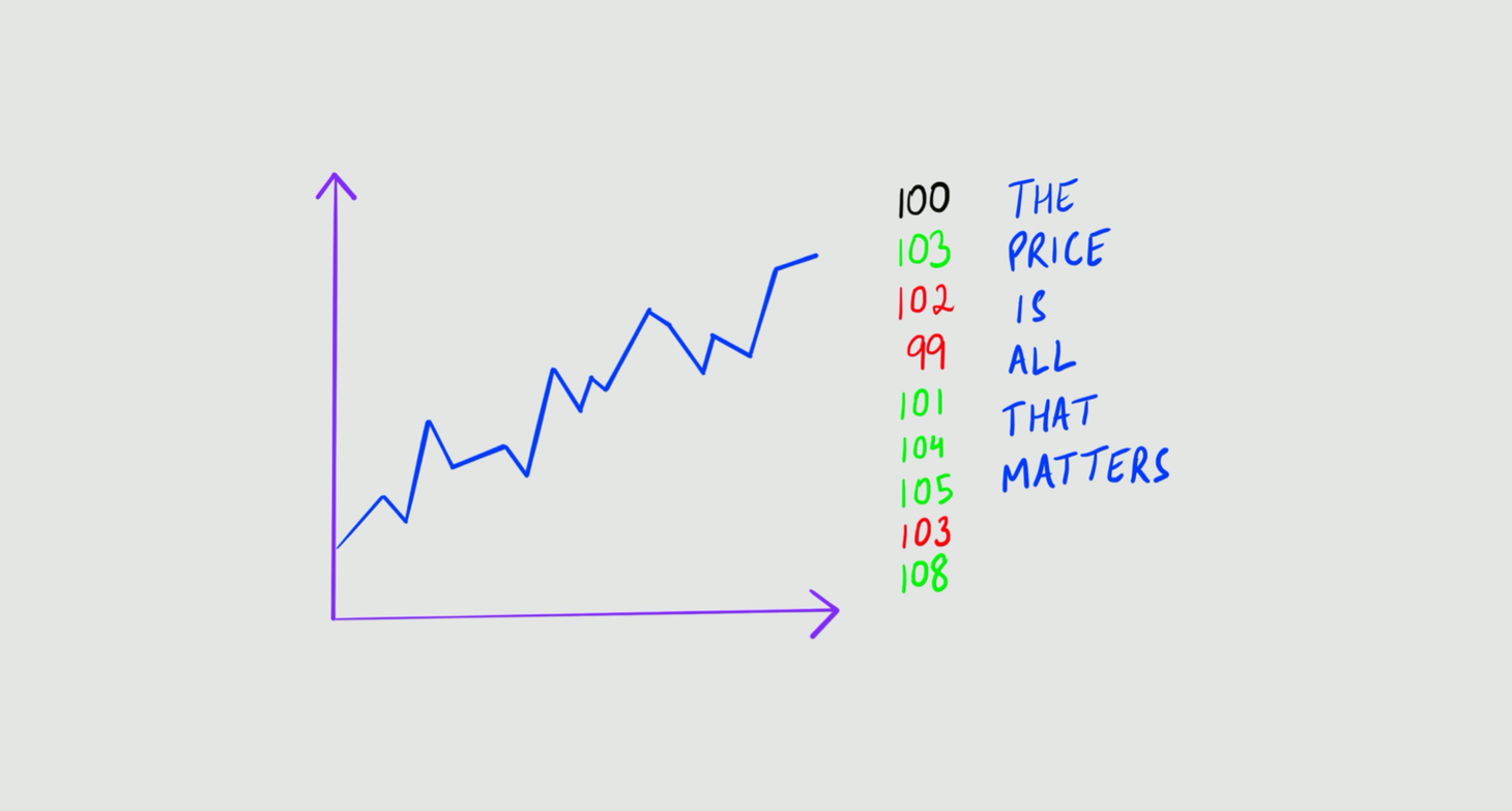
Table of Contents
The purpose of the Equity Investing Series, is to introduce the reader to the game of investing, with a focus on companies listed on the stock exchange. In Part 1 - Basics we laid the foundations. In Part 2 - Making Investing Decisions Based on Business Data we discussed the first of two popular approaches used to make investing decisions. In this article, we'll cover the second approach. I encourage you to take a look at Part 1 and Part 2 before you delve into this one.
Users of this approach - making investing decisions based on market data - focus on the fact that - price is the end result of all the forces of demand and supply. And the reason for analysing a stock is to forecast its future price, so as to make a trading profit. Thus, one should focus only on price, and nothing else!
I use this approach to decide when to enter and exit an investment.
With that, let's get into it in the following format -
The Rationale Behind Using Market Data
Users of market data are least concerned with whether the company they're trading in sells software, or clothes, or cars - they only look at the market data. That is - price and volume! They believe that - all information available, to all market participants, manifests itself through price and volume. Hence, by exclusively studying price and volume, one can know all there is to know.
Further, their research shows that history tends to repeat itself. So, they mine for trends within historical data, and see record how these trends pan out. If their findings suggest that, whenever pattern A is formed (say more than 70% of the times), pattern B follows. This insight allows them to trade with confidence.
"In order to know what is, we must know what has been, and what it tends to become."
The Process
In practice, there are two ways to study and use market data in investing. The first is by using charts - plotting time (in days, hours, months, etc) on the X-axis, and price on the Y-axis. The second is by using big data.
Either way, data is collected, analysed and tested, and then deployed in a live market.
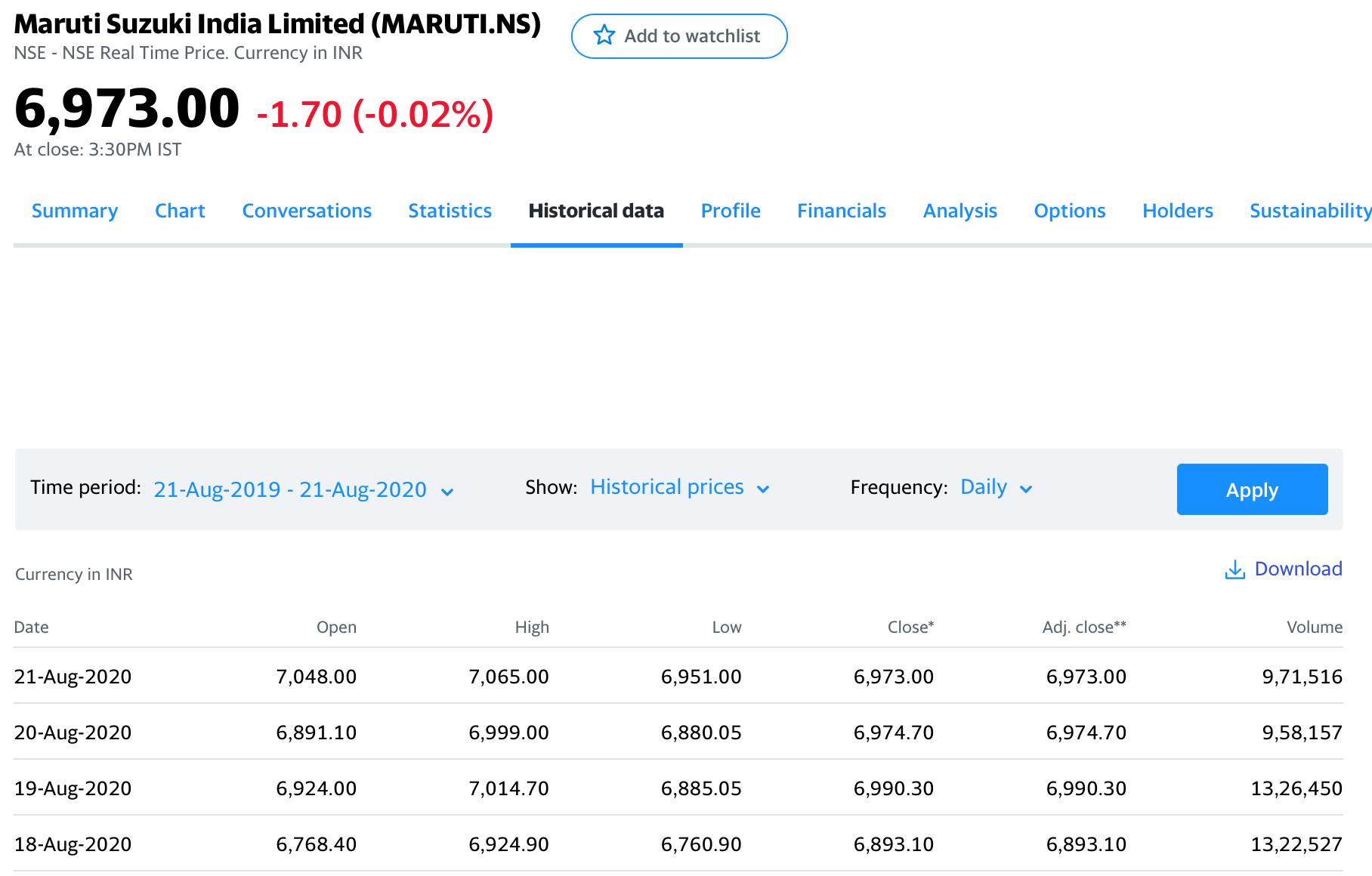
Collection now-a-days is through easily available softwares and databases (try - yahoo finance, trading view).
Analysis and testing is done by looking for trends in historical data, i.e. by testing strategies to find whether they would have delivered a trading profit at that time. Additionally, one can run the strategy as a trial (simulation) on the live market. This is a great way to check if it delivers expected results without using actual money.
Finally, the strategy is deployed in the live market with real money.
Using Charts
Hundreds of thousands of market strategies have been discovered by studying charts. Here, I'm sharing three popular tools used by chartists to formulate trading strategies.
Moving Average
Let's say, today you've started checking your weight at 8am every morning. On the 5th day, you compute an average. How? By adding them all up, and then divide the sum by 5.
Now, on the 6th day, if you have to find your 5-day-average weight, you would add your weight on the 2nd, 3rd, 4th, 5th and 6th day, and then divide it by 5.
If you do this everyday, you'll start getting a series of your 5-day-average weight, updated everyday. By plotting these numbers on a weight-day graph, you would get a "moving average" line.
Similarly, by calculating the average price of X preceding days, everyday, and plotting it on a price-date graphy, we get a line called the simple moving average line. Example -
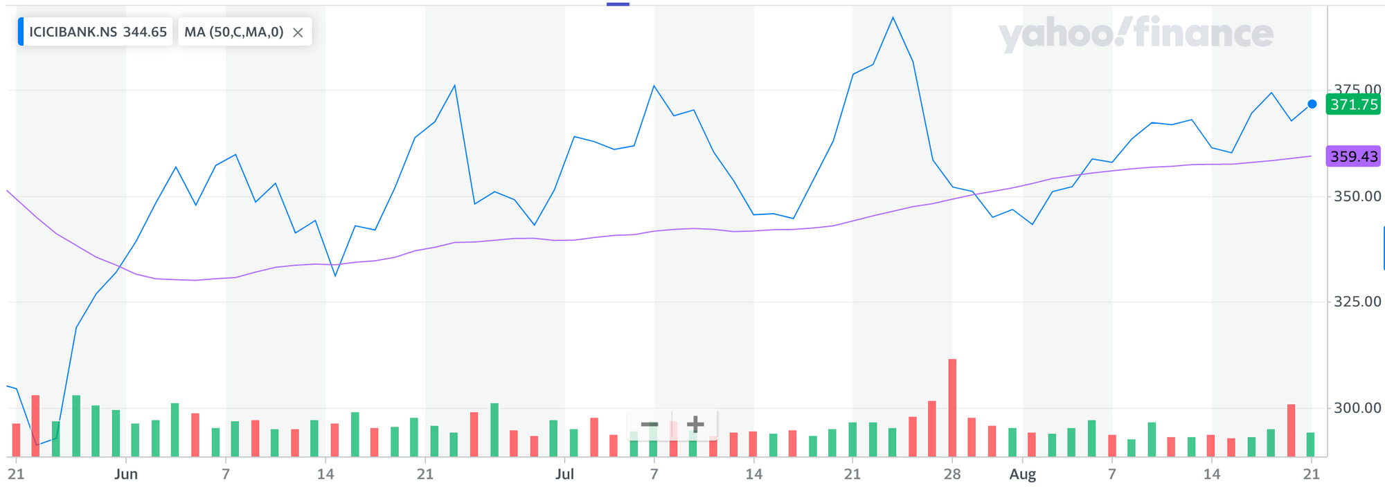
By plotting this line, you have created a trading tool, which upon analysis may prove to be helpful for your purpose. Now, your creativity and perseverance can fuel your hunt for a profitable trading strategy, i.e. a plan of how to trade, such that you win more often than you lose.
Here's an example of a commonly used strategy using the moving average tool. It's called moving average crossover. When the price line cuts the moving average line from below, and rises above it - it's a sign of a new uptrend (rising prices), a buy signal. After buying at this point, one can sell either when the price line comes back to cuts the moving average line from above and then goes below it, or upon realizing a predetermined profit. The opposite strategy can be used when these events happen in reverse order.
Relative Strength Index (RSI)
On every passing day, in some corner of the world, a trader comes up with a new tool, or a new trading strategy. Introducing the RSI, another popular tool.
It depicts the magnitude of price changes in a stock, using data from the preceding 14 trading periods. The RSI line swings within level 0 and level 100. Within this, level 80 and level 20 are considered significant.
If the RSI line crosses level 80, the stock is considered overbought, which means, it is set for a reversal in trend. So here, the trader sells the stock (expecting it's price to fall), and books profit after the price has fallen. Similarly, if the RSI line crosses level 20, the stock is considered oversold, which means that it's set for a new uptrend... the trader buys here and sells after realizing some profit. Many traders book profit once the RSI line hits level 50, others close the transaction when the RSI line hits either of the two significant levels (80 or 20).
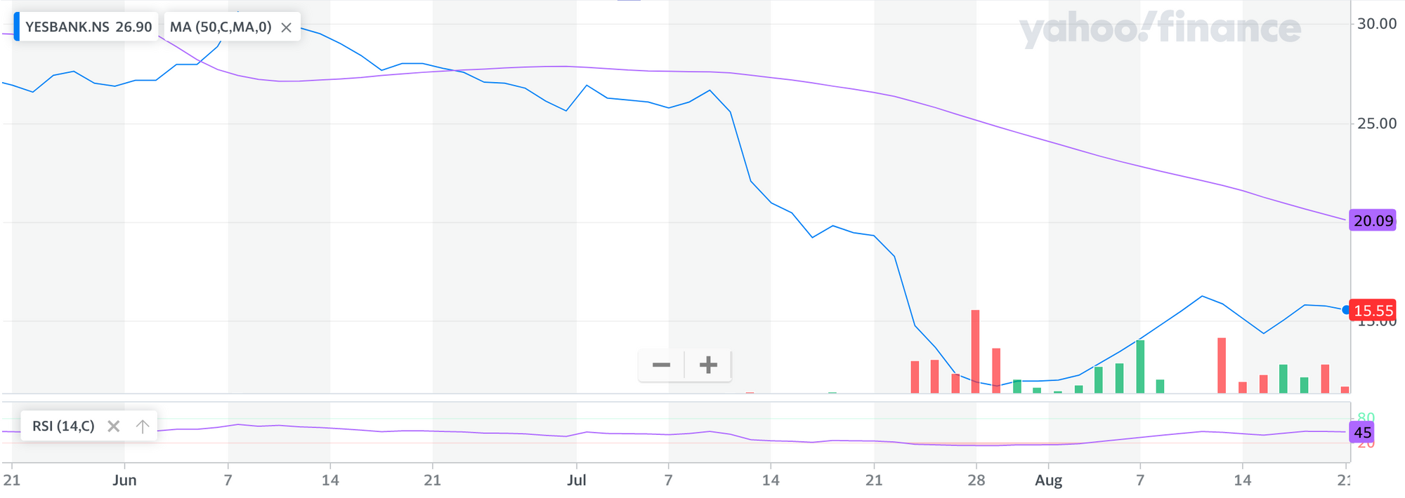
If you're a nerd like me, you can read more about RSI and how it's computed here.
Bollinger Bands
For some reason, I've always fancied Bollinger Bands! To understand them simply, let's first see what they look like -
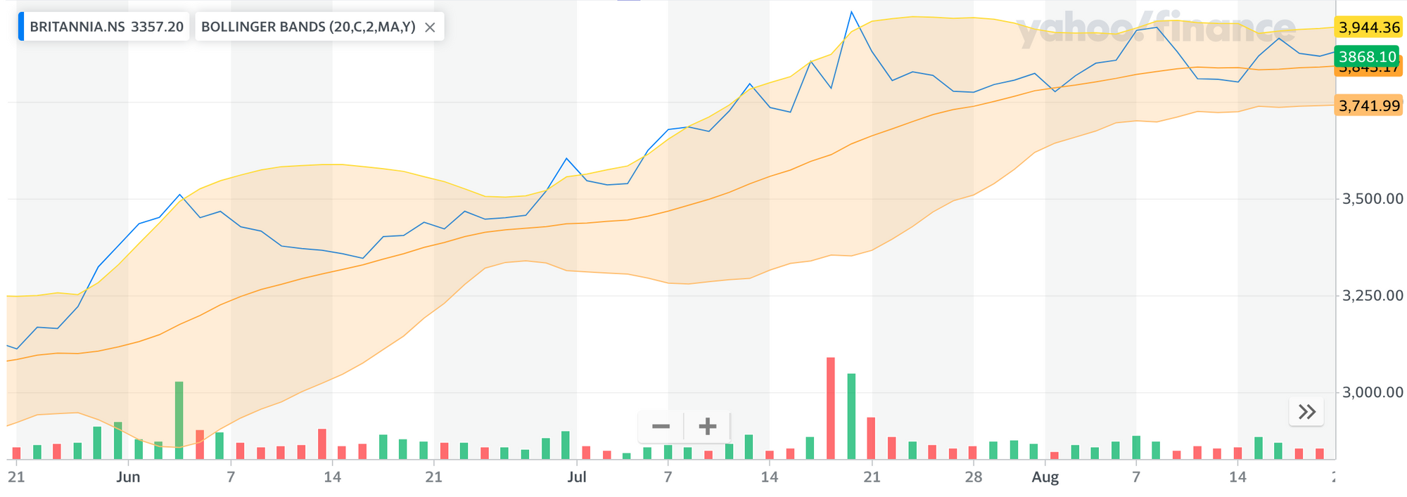
The 3 orange lines and the shaded area, are together called Bollinger Bands.
Think of the shaded area as a range within which the price line should be, 95% of the times. So whenever the price line goes outside this shaded range, it's a temporary occurrence. And it's bound to come back. So, when the price line goes outside the shaded area on the upper side, it's considered a buy signal, and when the same happens on the lower side it's considered a sell signal. After trading as per these signals, the trader books profit in one of many ways - either when the price line re-enters the shaded area, or when the price line cuts the middle orange line (moving average line), or on realising a predetermined profit.
There are many more charting tools, and if you're curious, the internet is your greatest resource!
Using Big Data
In the 21st century, literally everybody is using large chunks of data to find patterns and trends. Insight obtained from this exercise guide them to make well-informed decisions. The same is the case with investing.
Traders now accumulate enormous amounts of data, and run test strategies on it to find profitable strategies. (See - the Process)
In recent times, this approach has proliferated! Since computing is more powerful than ever, richer data is available, automation also comes in...
On that note, let me introduce algorithmic trading.
Algorithmic Trading
An algorithm is simply an ordered process, performed as per a predefined set of rules. Now take that to trading - when trading is done in an orderly fashion, as per a predefined set of rules, that's algorithmic trading.
Algo trading became popular when investors realised that their biggest enemy wasn't market fluctuations, but it was their own emotions. The overconfidence that comes from making money in the market, and the pain of losing money - are such strong emotions, that they inspire irrational decision making.
With powerful automation tools at our disposal, algo trading is quite the rage nowadays!
To know more about algo trading, check out this detailed blog post by Quantinsti.
To conclude, I'd like to give a shout out to Kunal Saraogi sir. A renowned chartist, who introduced me to this craft in 2014 in a two week course. He regularly features on Zee Business and presents well researched analysis on the markets. I recommend him to anyone who wants to learn more about charting.
For safe measure, I'm linking my disclaimer here. 🙌🏼
Stebi Newsletter
Join the newsletter to receive the latest updates in your inbox.